More Colors Means More Possibilities
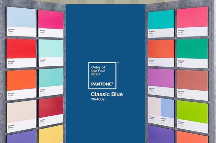
Outlooks shift. Attitudes transform. The living language of color deepens and refreshes itself in response to the changing environment. Our expansive collection of 315 new colors took into consideration the direction and movement of color trends and was curated to provide designers with the most sought-after hues for today and tomorrow.
Color palettes today are developed and driven by many elements including technology, entertainment, the economy, lifestyles, playstyles, cultural and social influences. Just as the seasonal aspect of color has forever changed and has evolved into one with a seasonless approach, color is no longer seen through the lens of gender. Illustrating the future and beyond, our 315 new colors are a selection of shades that are timeless additions to the PANTONE FASHION + HOME color palette.
The consideration of how multiple industries view the colors was key, and balance was a primary factor when selecting the colors to be added. With so much crossover today in palettes and products, it was essential that this comprehensive assortment of 315 new colors would be relevant for fashion and fashion related markets, home furnishings, interior and industrial design.
Reflecting areas of significant market importance, our new curated color collection includes neutrals, mid-tones, subdued and even ‘smoky’ variations of our most popular colors. At the same time, all color families were expanded for additional nuances and vibrancies; from the oranges, yellows, reds and pinks to the blues, purples, greens, blue-greens, whites and blacks. We added many mineral tones and nature influenced hues that could be called out as organic, earthy or burnt and our range of neutrals such as gray, beige, khaki and taupe have been dramatically increased.
All our new colors have been added into the system, which places them in the appropriate place within their respective color family. They will also be offered as new color supplements for each of the Pantone Fashion, Home + Interiors products.
The Color Families
REDS
As our traditional understanding of red continues to broaden, the red family carries on its reign of importance. Forever associated with passion, the vitality of these new reds is connected to action from protest to statement to individuality. We welcome these new elements of red in an expanded palette where we added more emphatic and robust reds containing both warm and cool undertones, with names like Fire Whirl, Adrenalin Rush, Emboldened and Watermelon as well as some deeper wine reds with hints of brown including Winery and Maroon.
PINKS
Pink has reached out to embrace new meanings and relevance beyond its traditional gender and child-like status. Taking on a significant role in protest and empowerment, spirituality and wellness, today’s pinks are lifestyle in nature; crossing genders and generations. The cornerstone of our new feelings of pastels, because of their association with positivity, good health, well-being, softness and compassion, all key issues of the next decade, pinks are above all non-divisive. Reflecting pink’s ascending role as a lifestyle color, we have increased our assortment across the shade range from the paler gentle tones of Slightly Pink, First Blush and Tender Touch to the more evocative Sangria Sunset and Viva Magenta which bring drama and excitement.
PURPLES
Our attraction to purple is suggestive of our new love and understanding of nature including nature’s flowers which can be seen everywhere from fashion runway to shop fronts throughout the design world. Bringing a sense of beauty, inspiration and joy, purples serve as an antidote to our increasingly busy and stressful lives. Highlighting purple’s ongoing appeal, our new collection of purples reflects the plethora of nature’s florals from First Bloom and Pale Pansy to the lilac tones of Nosegay and Bonbon and the more exotic Cattleya Orchid and Beautyberry.
ORANGE
An energizing color family, orange continues to captivate. The star of the orange family are the coral tones leading with the cooler Flamingo Plume and Dianthus while including the warmer Rosette and Murex Shell. Coral Paradise further underscores this heated color direction.
YELLOW
The addition of sophisticated stratas of yellows highlight our feeling for light effects and gold mineral hues while nature’s love of yellow’s high visibility value in flower and fruit are also critical to our new enhanced palette of yellows which feature some more true yellows, including the brighter High Visibility and Sunstruck, yellows with a green undertone, i.e. Yellow Plum and Quince, an array of orange yellows, i.e. Symphonic Sunset and Daylily as well as some more mustard shaded yellows, i.e. Gold Flake and Calendula to mix in some extra spice.
BROWNS
Browns have always been recognized as colors of taste and moment whose appeal has widened as we appreciate the significance of our earthly heritage and primordial beginnings. Emblematic of wood and craft, a color family we once took for granted grows more beautiful as our thirst for authenticity grows. Falling into shades that are more earth driven and organic, i.e. Mountain Trail and Brown Lentil, as well as luxurious, Chocolate Martini and Chocolate Fudge, the new colors in our brown family, from those that are more golden, i.e. Moonstone and Cartouche, to the more russet and red-based shades of Redwood Burl, Brandy Snifter, Sorrel Horse and Downtown Brown express greater color depth. We also brought in several of the delicious coffee and chocolate browns like Cocoa, Malt Ball, Macchiato and Cinnamon Swirl.
NEUTRALS + TAUPES
Our appreciation of the importance of minimalism and reduction in view of a circular and sustainable economy demands a better understanding of the possibilities that lie in beige and taupe hues. Too often seen as a single color, these neutrals offer a range of endless subtleties depending on the hues or the undertones they touch. Our new neutrals and taupes speak to the need for what is organic with names like Weathered Teak, Island Fossil and Fields of Rye. We additionally added Savannah Tan andTrench Coat, expressing our ongoing desire for more classic color choices.
GREENS
Natures crucial role in our health and well-being has led to a new relationship with the outdoors and all the greens to be seen there. However, while green is a color of our natural world, it also exists in the synthetic world where it infuses a futuristic element. It is the continued influence of the green family that led to the addition of a wide array of green shades ranging from the natural and earthy yellow greens like Avocado Oil and Camping Gear to the true green shades of Forest Elf and Abundant Green. Other important new additions include the herbal gray infused greens, i.e. Dried Sage and Tea Leaf, the warm olive infused Peat Moss and Cardamom Seed, deep blue influenced greens, Spruced Up and Dark Sea, and the citrusy energetic shades of Kiwi Colada and Fragile Sprout.
BLUES + AQUA/TURQUOISE
Our vision of blue is endless; reaching out to the sky for immensely ethereal tones, across the seas, where it encompasses all the varieties of water based aqua and turquoise shades and up through to the galaxy where it speaks to the immensity of the cavernous universe. Becoming more nuanced, we augmented our offering of blues through the addition of varying degrees of icy blues, such as Nantucket Breeze and Frozen Fjord, watery and cool aqua blues with names like Coastal Shade, Water Ballet and Spa Retreat, some brighter Turquoise tones, like Splish Splash and Swim Cap, ethereal shades like Endless Sky and Ebb and Flow, denim blues including Soft Chambray and Rain Washed, lightning blues including Super Sonic and Bluing, the deep classic navies, i.e. Ocean Cavern, Bellwether Blue and Polar Night, and vacation destination green infused blues such as Exotic Plume and Gulf Coast.
WHITES
A classic shade range that stands for purity as well as brilliance, we expanded our whites in both warm and cool tones. Suggestive of delicate florals and pale sanded beaches, these natural whites with names like Baby’s Breath and Summer Sand have a soft quality to them. Lucent White, a bright white that looks optically brightened, stands out in this palette of creamy whites.
GRAYS
Gray is an enduring classic, a color that no longer sits in the background but can instead make its own strong statement. Emphasizing grays strengthened position, we added a wide range of grays in varying color depths ranging from the quieter Weather Vane and Night Owl to the neutral Silent Storm all the way through to the deeper charcoal shades, i.e. Lava Smoke and Boulevard.
BLACKS
As we harmonize technology and nature in a new union, we see the relevance of new colors in nature including blacks in all its varieties from the greyed down Black Sand to the intensely profound shades of Black Oyster, Volcanic Ash and Unexplored, a few examples of the new galactic blacks that add to the depth of black hues in our palette.
Welcome!Log into your account


